15 Steps To Handover Your Webdesign To a Developer Like a Pro

I’ve been a designer for over ten years. I recently started working a lot with Webflow to take my work from pixels to code. With that, I shifted my focus on pretty much only taking on visual development work for my clients.
With this visual developer journey and being now on both sides of the process, I’ve learned so many things about the design handover that we Designers can improve! Not only how to become more favourable by your devs or webflow friends. But also, give them less space to guess and avoid them designing some of the missing pieces.
I decided to create a checklist for designers working on websites. I’ve included all the important steps designers should not miss when preparing the visuals for the website devs. This checklist will help you rapidly speed the whole design-to-code process, and reduce the number of emails and slack messages before you launch your website!

1 — Define Typography
Prepare a separate page with all different types of fonts used in Desktop view. Then prepare 1–3 more to show how to scale your typography on Tablet and Mobile view.
(e.g.) To easily tell that heading1 is 70px on desktop and 32px on mobile.

2 — Folder with Fonts and the right weights
Send over only the files used in the design. Add only the font weights used in your design. And if you can provide all the different font file types to get the best browser support.
Reason: So your devs don’t have to go over the whole design and guess if you used in any part Semibold Italic when you send over the entire font family.

3 — Define Colors
This is excellent maintenance for your design as well. Reduce grey shades into 3–4 different swatches and list out all colors used in the design. Bonus points for using styles across your design with an easy to follow names.

4 — Define widths of your website & grid system
Set an easy page with an example of your grid, ideally with notes about the main content width wrapper. Is it 1100px or 1280px? And is there one main wrapper or subpages that have one more?
5 — Responsive
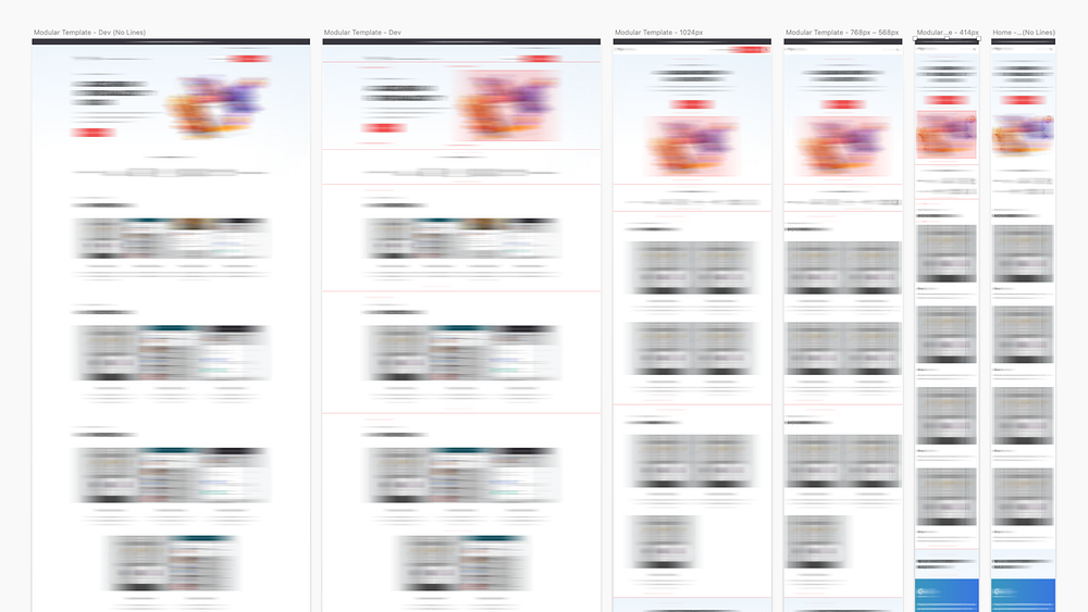
We (Designers) always complain about how our designs were translated. Still, we usually fail to deliver the most that we can — prepare at least one design (e.g., homepage) for all different viewports. To reduce the space to guess how the design was intended.
5.2 — Spacing
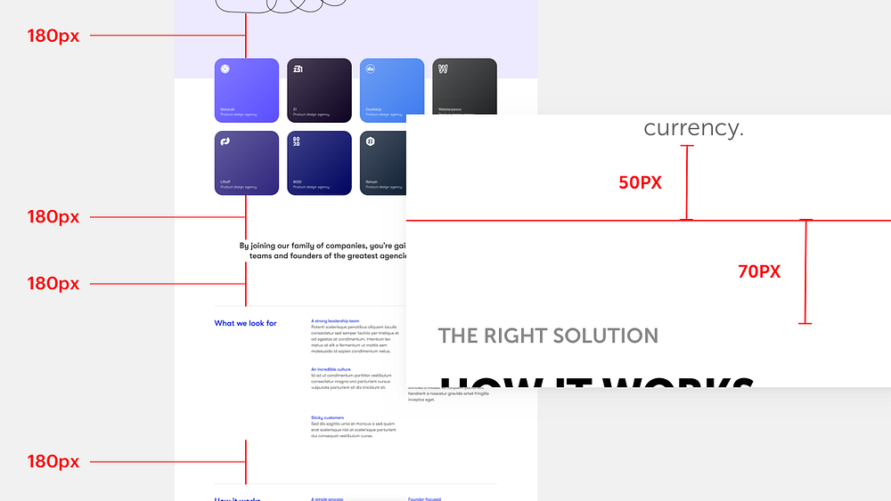
Set your grid well and keep your margins in place. In other words, work with a 4px grid or just additions of 10px for example — 80px margins between sections or 16px distance between grid items!
Reason: Nobody wants to add different CSS values for each element.
6 — Prepare assets
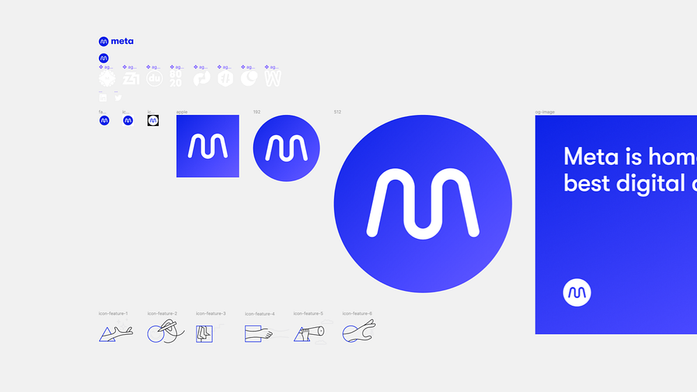
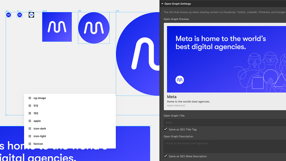
Any images in your designs? Add one more canvas/page just for the assets — all next to each other with custom names so your dev can select everything and export it with one click. The same goes for sharing images and favicon.

6.2 — Icons in squares
Logos of partners, icons in the 3x2 section of features usually have different sizes when exported (height and width). Prepare all icons and logos in square canvases, so everything scales nicely without your dev doing this same work anyway.
6.3 — This is also a way to learn that 100px shadow is an insane thing
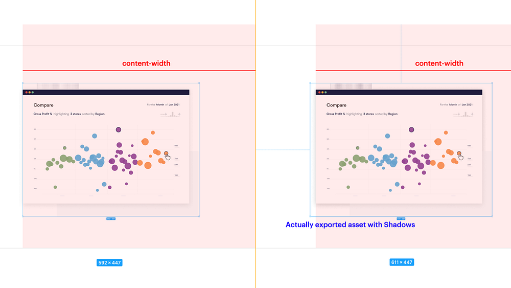
The same goes for all the shadows. We, as designers, love smooth shadows and floating elements. It all looks nice in your designs but once exported, all the shadow is exported with it, and your devs have to positioned absolutely or hack their way around it somehow. This is also excellent training to see your assets before handing them over. One side will still have to decide this. Be the designer and do this without the devs guessing and working on the designs on their own.

7 — Hover states
Put all your elements that interact with the user’s mouse on a separate artboard and prepare all states such as hover, click, pressed. If you know a bit of CSS, you can also specify the transition timing e.g., button — switch the bg-color in 400ms.

8 — Input states
Prepare how the input/textarea should look like when interacted with. 4 States to keep in mind — Hovered, Placeholder, Pressed, and Focused.
9 — Form States (Error/Success messages)
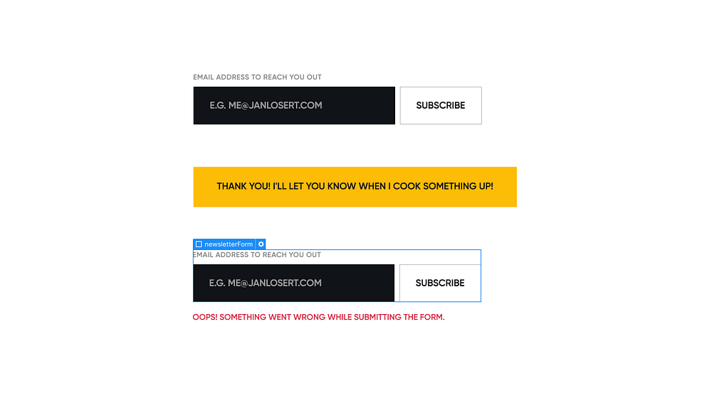
Define states of your forms. In Webflow you define 3 states — default, successfully submitted, and error states on inputs. Go the extra mile and also provide a copy that will be on those messages?

10 — Open navigation
Design states of your navigation. Especially on mobile view, show how you intend your sign-up button to be displayed on 414px — 320px viewport. Define how opened dropdown items look like and how opened menu on mobile is intended to look like.

11 — Tab/Slider states + Assets
The same goes for states of tabs and slides. Usually a very overlooked part of the design. Is there a component with tabs? Prepare exportable graphics for each of them.
12 — Sharing images and Title and Description for each subpage
We’re almost done! Prepare a favicon (icon in the browser tab) and design a nice graphic for your website once it’s shared on socials. So the sharing post looks great as your site! (size 1200x627px)
If you're in the client position provide Title and Description of each subpage in a separate document so that every page is a unique in eyes of the search engine.
13 — 404 page
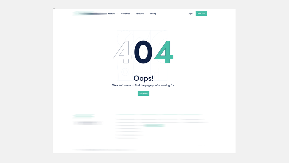
Spend time designing your 404 page, not just for the lovely graphics but also for deciding where to point your visitors to once they land on non-existing links. (Should they go just to the homepage or contact support or the latest from the blog?)

14 — Alt tags for Images/Links
With the accessibility awareness, it’s fantastic if the client provides a doc/spreadsheet of alt-tag or descriptions of the images ->, e.g., Hero Image: Client dashboard displaying analytics of your latest week, or anything close to that!

15 — Define CMS logic
Webflow only — If you are aware as a client of the platform you work with — define CMS logic and type of item in each of your collections. Set your boundaries for the content right from the beginning (your devs will ask for this at some point anyway)
The End
With that said — You don’t have to do all of it, but if you want to ensure the best outcome of the transition to code, it should be in your best interest to go the extra mile. If you’re already doing 10 points out of these – Thank you so much! Working with you is probably a pleasure.
P.S. I pretty much wrote this as a guide for my future cooperations to set some groundwork right from the start. DM me on Twitter or leave a reaction here with anything you are requesting from your designers or developers I'll be happy to hear more people talk about this topic!
I'm tweeting about design, webflow and no-code here: Twitter — Jan Losert
Originally as a Twitter thread here: https://twitter.com/JanLosert/status/1376554499511320580
